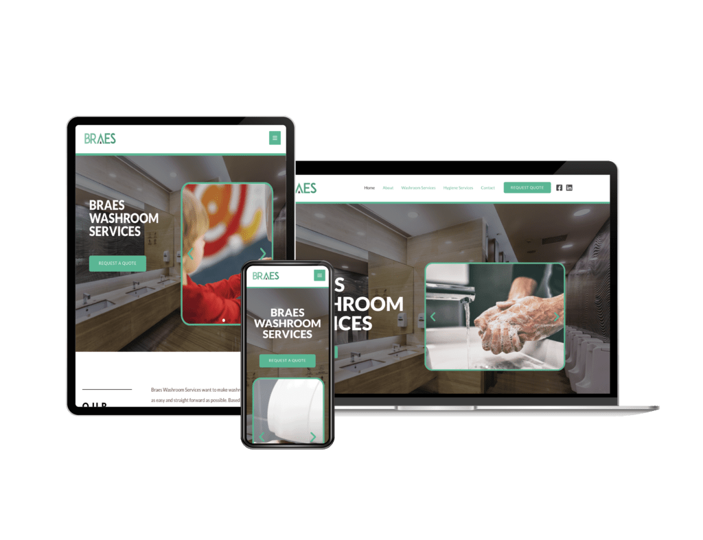
In 2024, web design is no longer just about aesthetics; it’s about creating an experience that works across all devices. With more users accessing websites on smartphones and tablets, responsive web design has become essential. A website that adapts seamlessly to different screen sizes improves both the user experience and SEO performance.
What is Responsive Web Design?
Responsive web design ensures that a website’s layout and content adjust to fit the screen of the device it’s being viewed on. Whether a visitor is using a smartphone, tablet, or desktop, the content remains accessible and user-friendly. This is achieved through fluid grids, flexible images, and media queries.
💡 Why does this matter?
In 2024, mobile devices account for over 50% of global web traffic. Google even ranks mobile-friendly websites higher due to its mobile-first indexing algorithm. If your website isn’t responsive, you risk losing potential customers and falling behind in search rankings.
The Benefits of Responsive Web Design:
1. Enhanced User Experience 🌟
A responsive design offers users an optimised experience no matter what device they’re using. For example, websites with touchscreen capabilities offer a smooth experience on mobile devices, while larger layouts are perfect for desktop users. This seamless experience improves user satisfaction, reduces bounce rates, and increases time spent on the site.
2. Increased Conversion Rates 📈
An adaptable website with easy navigation and clear call-to-action buttons leads to higher conversions. Visitors are more likely to take action—whether it’s signing up for a newsletter, making a purchase, or filling out a contact form—if the site functions well on their device.
3. Lower Maintenance Costs 💸
Instead of building separate versions of your website for mobile, tablet, and desktop, a responsive design consolidates everything into one. This reduces ongoing maintenance costs, as you only need to update one site rather than multiple versions.
4. Improved SEO Performance 🔍
Google prioritises responsive websites in its search results. As mentioned earlier, mobile-first indexing means that Google uses the mobile version of your site to rank it. Sites that aren’t responsive may see a drop in rankings, which can hurt your visibility and traffic.
5. Future-Proof Design 🛠️
As new devices with different screen sizes emerge, responsive web design ensures that your website remains accessible. With a flexible design, your site will be ready to adapt to future technologies and user behaviors.
Key Features of Responsive Web Design:
- Flexible Layouts: Using a percentage-based approach instead of fixed units like pixels allows your site’s layout to adjust based on screen size.
- Adaptive Images: Images are resized according to the screen, which helps reduce page load times and data usage.
- Media Queries: These CSS rules ensure the website responds to changes in screen size and resolution.
- Mobile-Friendly Navigation: Simplified menus or hamburger menus make it easier for mobile users to navigate a site.
Final Thoughts:
Responsive web design is no longer optional—it’s a must-have for businesses that want to succeed in 2024. Not only does it improve the user experience and increase conversions, but it also helps your site rank higher on Google. If your website isn’t responsive, it’s time to consider a redesign that works seamlessly on all devices.
📩 Looking to create a responsive website? Reach out today!
🌐 Learn more at hamburgerdesign.co.uk
#ResponsiveWebDesign #SEO #UserExperience #WebDesign #MobileFirst #HamburgerDesign